Build responsive GUI layouts that work across different screen sizes and orientations using the FlexBox and Grid classes.
Intermediate
Windows, macOS, Linux, iOS, Android
FlexBox, FlexItem, Grid, GridItem
Getting started
This tutorial assumes understanding of simple layout techniques using the Rectangle class as explained in Tutorial: Advanced GUI layout techniques. If you haven't done so already, you should read that tutorial first.
Download the demo project for this tutorial here: PIP | ZIP. Unzip the project and open the first header file in the Projucer.
If you need help with this step, see Tutorial: Projucer Part 1: Getting started with the Projucer.
The demo project
The demo project demonstrates different responsive layout techniques using FlexBox and Grid objects when dealing with variable screen sizes and resolutions. If we first run the project in its initial state, it should look something like this:
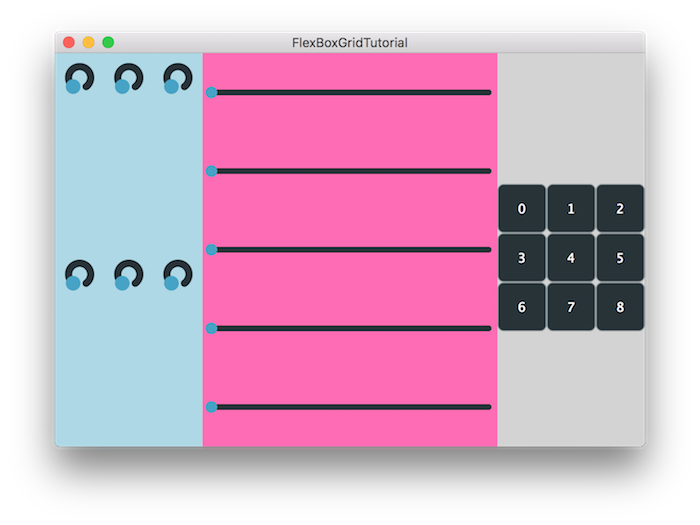
The demo project application window
Right now, the layout uses common non-responsive techniques to lay out the components on the screen and does not accomodate for orientation changes. We will make use of the FlexBox and Grid items to eradicate these problems.
The FlexBox and Grid layout systems
The FlexBox and Grid classes are highly inspired by the responsive layout practices used in CSS web development. If you have designed a responsive website before, you should be familiar with the layout systems described in this section.
When using FlexBox, we first need to define the direction of layout as horizontal or vertical and every subsequent computation will be executed on this basis. We call this direction the main axis and its perpendicular counterpart the cross axis. Based on this information the following properties will affect the layout as follows:
- Justification affects the position of items along the main axis.
- Alignment affects the position of items along the cross axis.
- Wrapping is performed on overflow of items on the main axis by spilling on the cross axis.
The items inside the container are defined by the FlexItem class and have 3 flexible properties that affect its dynamic resizing:
- Flex-grow defines the ability for an item to grow if necessary.
- Flex-shrink defines the ability for an item to shrink if necessary.
- Flex-basis defines the default size of an item before dynamic resizing.
As a two-dimensional layout system, Grid works on both the row axis and the column axis. Similarly to FlexBox, the following properties will affect the layout as follows:
- Justification affects the position of items along the row axis.
- Alignment affects the position of items along the column axis.
- Wrapping can be performed on overflow of items on rows or columns.
GridItem objects are contained within the Grid and have useful properties that affect its size:
- Margin can provide gaps around specific items.
- Span can extend items to fill more than one grid cell.
Now that we know how specific properties can affect these layout systems we can start implementing those changes in our demo project.
Using FlexItem and GridItem objects
Let's start by replacing the button layout in the RightSidePanel::resized() method using FlexBox:
void resized() override
{
fb.flexWrap = juce::FlexBox::Wrap::wrap;
fb.justifyContent = juce::FlexBox::JustifyContent::center;
fb.alignContent = juce::FlexBox::AlignContent::center;
for (auto* b : buttons)
fb.items.add (
juce::
FlexItem (*b).withMinWidth (50.0f).withMinHeight (50.0f));
fb.performLayout (getLocalBounds());
}
- : We create a FlexBox object.
- : We can specify whether we want our objects to wrap around in case of overflow.
- : We justify the content to the center of the bounds.
- : We specify the alignment of the content to the center.
- : We iterate over the TextButton components and add them as FlexItem objects to the items array of the FlexBox object. The FlexItem can be constrained as in this case where we set the minimum width and height of the button. We can alternatively set its maximum width and height using the
withMaxWidth() and withMaxHeight() methods respectively.
- : We perform the layout logic on the FlexItem objects by specifying the bounds to the
performLayout() method.
As for the rotary slider layout on the left side panel, we adjust our LeftSidePanel::resized() method accordingly:
void resized() override
{
knobBox.flexWrap = juce::FlexBox::Wrap::wrap;
knobBox.justifyContent = juce::FlexBox::JustifyContent::spaceBetween;
fb.flexDirection = juce::FlexBox::Direction::column;
fb.items.add (juce::FlexItem (
knobBox).withFlex (2.5));
fb.performLayout (getLocalBounds());
}
- : This time we specify that we want to have the items spaced out by specifying the
JustifyContent::spaceBetween property.
- : The knobs are added in the same way to the items array with an additional flex-grow value of
1. The flex-grow factor determines the amount of space inside the container that the item should take up.
- : Another FlexBox is created to act as a container for the previously created FlexItem objects and the main axis of the flex layout is set with the
Direction::column property.
- : The previously defined FlexBox is added as a FlexItem to the container FlexBox with a flex-grow factor of
2.5.
Nesting FlexBox objects allows us to create intricate responsive layouts with ease by encapsulating smaller groups of Components together.
Lastly, we can deal with the main panel sliders by making them responsive to orientation changes in the MainPanel::resized() method:
void resized() override
{
auto isPortrait = getLocalBounds().getHeight() > getLocalBounds().getWidth();
fb.flexDirection =
isPortrait ? juce::FlexBox::Direction::column
: juce::FlexBox::Direction::row;
for (auto* s : sliders)
{
s->setSliderStyle (
isPortrait ? juce::Slider::SliderStyle::LinearHorizontal
fb.items.add (juce::FlexItem (*s).withFlex (0, 1,
isPortrait ? (
float) getHeight() / 5.0f
: (
float) getWidth() / 5.0f));
}
fb.performLayout (getLocalBounds());
}
- : First, we determine whether our device is in portrait or landscape by checking the width and height.
- : Next, we can decide on the main axis direction accordingly and set the appropriate property.
- : Similarly, we set the appropriate slider style to match the device orientation.
- : When adding the sliders to the items array, we provide a flex-basis by determining the proportion of each slider in the direction of flow.
The sliders will now accomodate to the device orientation and adjust direction accordingly.
Finally, we can change the overall layout system of our panels to use flex as well:
void resized() override
{
juce::FlexItem left ((
float) getWidth() / 4.0f, (
float) getHeight(),
leftPanel);
juce::FlexItem right ((
float) getWidth() / 4.0f, (
float) getHeight(),
rightPanel);
juce::FlexItem
main ((
float) getWidth() / 2.0f, (
float) getHeight(),
mainPanel);
fb.items.addArray ( { left,
main, right } );
fb.performLayout (getLocalBounds());
}
If we run our newly-modified code to use flex, we should see something like this:
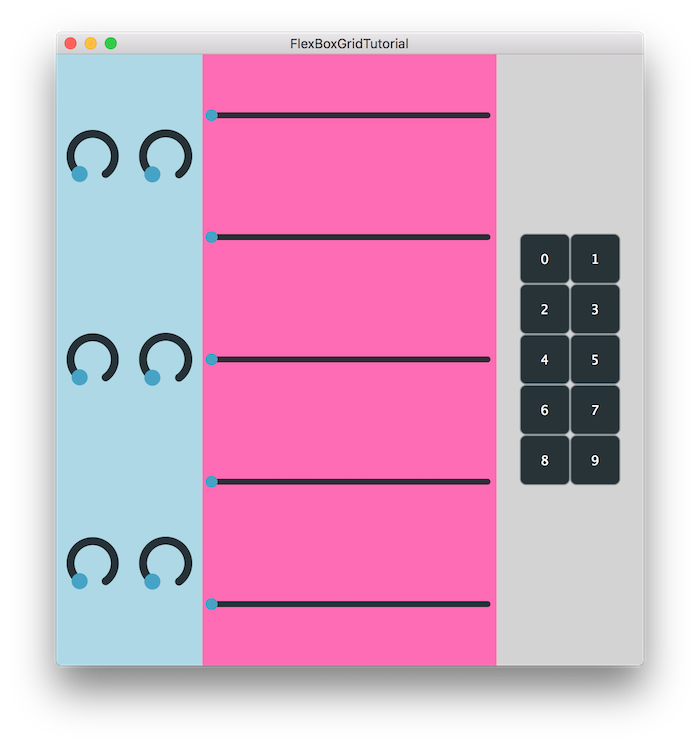
The demo project application window using flex
- Note
- The source code for this modified version of the code can be found in the
FlexBoxGridTutorial_02.h file of the demo project.
Let's try to implement the last portion of code using the Grid class instead. Here we create a Grid object to perform our layout operations on, just like flex:
void resized() override
{
using Track = juce::Grid::TrackInfo;
using Fr = juce::Grid::Fr;
grid.performLayout (getLocalBounds());
}
However instead of specifying the flex-grow, flex-shrink and flex-basis values on the individual FlexItem objects, in this case we set the number of rows and columns on the Grid object using TrackInfo objects. The constraints can be specified in fractions or pixels by using the _fr and _px suffixes respectively. In this example we define a grid with 1 row and 3 columns with the center column taking twice as much space as the others.
- Warning
- Pixels in JUCE are not equivalent to physical pixels. Internal calculations convert the pixel density depending on the screen DPI resolution.
- Note
- The source code for this modified version of the code can be found in the
FlexBoxGridTutorial_03.h file of the demo project.
Pro and cons of FlexBox and Grid classes
There are many cases where either of these classes can be used to create responsive layouts. However there are certain scenarios where one is more suitable and sometimes even necessary to solve certain layout constraints.
Some of the advantages of the FlexBox class:
- Suitable for laying out components where a main axis is desired.
- Content wrapping, direction and alignment is easily specified.
- Can accomodate unaligned content over the cross axis.
Some of the advantages of the Grid class:
- Suitable for 2D grid-type layouts where rows and columns are aligned.
- Ratios of components can be specified in fractions or pixels.
- Can accomodate spanning content over multiple rows or columns.
- Exercise
- Implement the previous FlexBox layouts using the Grid class instead. Were there any inconvenient use cases where the FlexBox class was more suitable?
Summary
In this tutorial, we have learnt how to design responsive layouts using the FlexBox and Grid classes. In particular, we have:
- Learnt the layout logic for FlexItem and GridItem objects.
- Handled orientation changes and adapted our interface accordingly.
- Discussed the pros and cons for each of these classes.
See also
