
Loading...
Searching...
No Matches
Build your application for different screen sizes. There are many available screen sizes on Android, this tutorial examines some strategies to manage this.
Level: Intermediate
Platforms: Android, macOS, Windows
Classes: Desktop, AffineTransform, TabbedComponent
This tutorial illustrates a handful of strategies for managing different screen sizes on the Android platform using JUCE. There are several demo projects to accompany this tutorial. Download links to these projects are provided in the relevant sections of the tutorial.
If you need help with this step in each of these sections, see Tutorial: Projucer Part 1: Getting started with the Projucer.
The demo projects provided with this tutorial illustrate several different methods for managing different screen sizes on the Android platform using JUCE. Broadly, these methods are:
With devices that expect fullscreen operation in particular (such as mobile devices) it is a challenge to design user interfaces that are effective on all screen sizes and for various device orientations. This is a particular challenge on the Android platform where there are many possible screen sizes and resolutions. There are three main issues here:
The relationship between the physical size and the resolution is important. It is especially important when considering high resolution screens where the physical pixels are smaller, and more densely packed, than standard resolution screens. The combination of a particular physical screen size and its resolution results in the screen's dots-per-inch (DPI). This is related to the screen pixel density. This is how many physical pixels take up the space of a "software" pixel, in each dimension, as a pixel on a standard density screen.
For some applications the physical size will be most important. This may be, for example, where an application uses complex interaction comprising delicate finger movements. In this case the screen size and the size of the typical user's hand is important. In other applications the DPI of the screen is more important. For example, text will remain readable using smaller font sizes at higher DPIs. But there is a limit to how readable text will be, when measured using its physical size on the screen. You will sometimes need to take both the physical size and the resolution (and therefore the DPI) into account when designing your application.
By default, JUCE scales its coordinate system based on the pixel density of the screen. This means that shapes and text drawn on a high density screen should appear roughly the same physical size as they do on standard density screens. In JUCE, you can access information about a particular display via the Desktop class. Here you can find the available displays and which one is marked as the "main display" (especially if there are multiple displays).
Unfortunately, the value that JUCE can access to obtain the display's DPI is only an approximation (since not all screen devices report this information properly). This means we can't measure the physical size of the user's screen accurately. But the information provided by the Desktop class should be good enough as a guide for scaling your user interface depending on the needs of your application.
In each of the examples that follow we use a child component, called ResizingComp, that is managed and resized by the parent component (MainContentComponent).
Download the demo project for this section here: PIP | ZIP. Unzip the project and open the first header file in the Projucer.
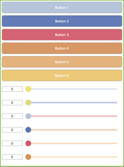
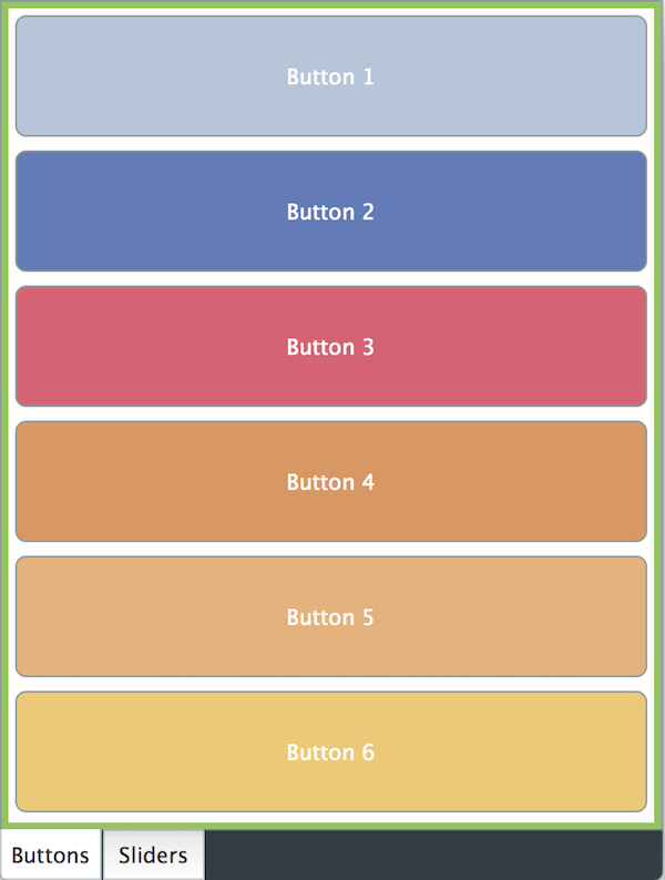
In this example we use a simple interface containing a collection of sliders and buttons. Each of these child components is given a proportion of the screen's height (minus a small border around the edge). A similar approach could be taken in the horizontal dimension. For simplicity, the sliders and buttons just take up the whole width of the screen (again, minus a small border). With a screen in portrait orientation and a size in the region of a few hundred pixels this will look similar to the following screenshot:
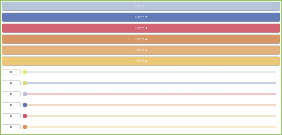
In landscape orientation it will look something like the following screenshot:
To store the buttons and sliders in the ResizingComp class we use the OwnedArray template class (which means that these child components will be deleted automatically in the ResizingComp destructor). First, in the ResizingComp constructor, we build an array of Colour objects. These are used to set the colours of the buttons, the slider thumbs, and the slider tracks:
We then use a for() loop to allocate and configure the multiple buttons:
And the sliders are set up similarly (although we mix up the colour selection using the array of colours to keep it interesting).
In order to be more usable with a touchscreen interface the slider thumb has been customised so that it is usually larger than the standard size. To do this we have added a subclass of the LookAndFeel_V4 and overridden the LookAndFeel::getSliderThumbRadius() function.
We add an instance of this class as a member of our ResizingComp class:
And at the end of our ResizingComp constructor we set this as our look-and-feel for this component and all of its children.
And in our ResizingComp destructor we set this to nullptr.
In the ResizingComp::resized() function we iterate over the arrays of buttons and sliders and set their bounds:
Here we us a constant value (8) to separate the components. Then we calculate the "widget height" based on the available height and the number of "widgets" (buttons and sliders) that we have.
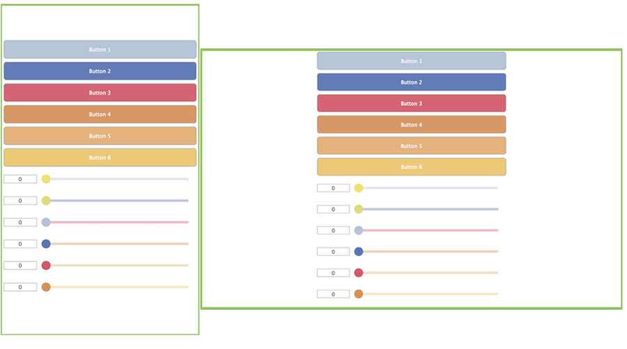
If the screen size is too small then the interface becomes unusable and unreadable as shown in the following screenshot:

Having said this, it should look reasonable on most Android devices.
Download the demo project for this section here: PIP | ZIP. Unzip the project and open the first header file in the Projucer.
This example uses an alternative to resizing the child components. Instead, the ResizingComp component is set to a nominal size (480 by 640 pixels) and then the MainContentComponent object applies an affine transform to scale this up or down to match the screen size. This is done while keeping the same aspect ratio (leaving whitespace to the side or above and below the sliders and buttons). The code for the ResizingComp class is the same as for the simple resize example. But in the MainContentComponent::resized() function we set the size of the ResizingComp component then calculate the required transform:
This code calculates the ratio between our nominal size and the actual size of the screen in software pixels. It then chooses the smallest of these ratios in order to maintain the aspect ratio, while keeping all of the content onscreen. We then create an instance of the AffineTransform class using the AffineTransform::scale() function and centre the scale transform around the centre of the screen. The transform is applied to the component using the Component::setTransform() function. The result is quite different from the simple resize method.
Download the demo project for this section here: PIP | ZIP. Unzip the project and open the first header file in the Projucer.
This example looks at one method of displaying a different layout depending on the orientation of the screen (or device). The Desktop::getCurrentOrientation() function provides means of accessing the device orientation. In fact, there are four possible orientations:
For simplicity, in this tutorial, we are going to treat portrait orientation as a screen that is taller than it is wide (and landscape orientation as a screen that is wider than it is tall).
This example uses the same technique for scaling the user interface using a transform that we saw earlier. The differences are that this ResizingComp class uses a different layout depending on the orientation, and the MainContentComponent class has two nominal sizes (one for landscape orientation and one for portrait orientation). The orientation is determined in the MainContentComponent::resized() function:
Then, in the ResizingComp::resized() function we select from two resizing functions depending on the orientation:
The resizedPortrait() and resizedLandscape() functions then use different arithmetic to layout the buttons and sliders.
When the landscape orientation is used, the buttons and sliders are shown in two columns, rather than one column. This is shown in the following screenshot:
Download the demo project for this section here: PIP | ZIP. Unzip the project and open the first header file in the Projucer.
This final example uses different layouts for different screen orientations and screen sizes. This kind of technique might be especially useful if you want to use a totally different layout for screen orientations or even make a universal application for Android phones and tablets. The method employed here is to use the TabbedComponent class to arrange pages of components if they won't fit onto a single page.
The responsibility of the ResizingComp class changes a little in this project compared to the three earlier projects. In particular, we don't add the buttons and sliders as direct child components. Notice the lack of calls to the Component::addAndMakeVisible() function in the following code for the constructor:
The ResizingComp class manages the lifetime of the buttons and sliders but in terms of component hierarchy they are added to one or more instances of another component class called ComponentHolder.
The ComponentHolder class holds an array of Component pointers and lays the components out in one or two columns depending on the orientation. (The technique for achieving this layout was covered earlier when looking at different screen orientations.) There is a single function—(ComponentHolder::addComp()—for adding a component that adds it to the internal array and calls Component::addAndMakeVisible():
The layout functions—ResizingComp::resizedPortrait() and ResizingComp::resizedLandscape()—should look familiar. Although these need to be slightly different since we no longer have separate arrays of sliders and buttons:
If the screen size is large, then only one of these ComponentHolder components is created and all of the buttons and sliders are added to it. If the screen size is small then the ResizingComp class uses a TabbedComponent object and adds two instances of the ComponentHolder class to form the tabs of the TabbedComponent. This decision to use a single page or multiple pages is managed by the ResizingComp class in the ResizingComp::resized() function.
Here you can see that we're saying a "large" screen is one that has one of its dimensions greater than or equal to 480 software pixels. Of course, you can choose a different value for your applications. The ResizingComp::layoutSinglePage() function is straightforward:
Here you can see that we add all of the buttons and sliders to the ComponentHolder instance and add it as a child component of our ResizingComp object. The ResizingComp::layoutTabs() function is only a little more involved:
holder member using the orientation of the screen to position the tab buttons.ComponentHolder objects.true arguments tell the TabbedComponent objects that they can delete the ComponentHolder objects when they are no longer needed).ResizingComp object.When the size of the screen is determined as "small" then the TabbedComponent is used as shown in the following screenshot.
In this tutorial we have examined various issues to do with Android device screen sizes and orientations. In particular we have: