
Loading...
Searching...
No Matches
This tutorial introduces the Slider class, shows how to respond to slider movements, and how to obtain values from a slider. The tutorial also introduces some essential customisation techniques for displaying values with a slider.
Level: Beginner
Platforms: Windows, macOS, Linux, iOS, Android
Classes: Slider, Slider::Listener, Label
Download the demo project for this tutorial here: PIP | ZIP. Unzip the project and open the first header file in the Projucer.
If you need help with this step, see Tutorial: Projucer Part 1: Getting started with the Projucer.
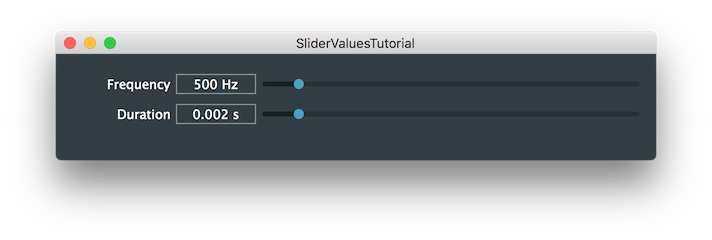
The demo project shows two linear horizontal sliders. One slider is labelled Frequency and the other is labelled Duration as shown in the following screenshot:
The idea is that both sliders essentially display the same underlying value since frequency (f) is the reciprocal of duration (d):
f = 1⁄d
When either of the sliders are moved, the other one updates to reflect the change.
This tutorial shows how to create the sliders, configure their range, listen for changes in value, and update the slider value programmatically. You will notice in the demo application, when it runs, that both sliders include a text box, and this text box also includes the units for frequency (Hz, Hertz) and duration (s, seconds).
The sliders have been added as private members to our MainContentComponent class:
Notice that we also add a Label object for each Slider object. These are to display the text Frequency and Duration to the left of the sliders. The boxes immediately to the left of the slider controls, which show the current slider values, are actually part of the Slider objects.
We have also added the Slider::Listener class as base class, so that we can register our class to receive slider changes
In our MainContentComponent constructor, we add the sliders as child components (see Tutorial: Parent and child components), make them visible, and configure the range of values that the slider can represent. First we configure the frequencySlider member:
MainContentComponent object as a listener to the slider.The corresponding label is set up as follows:
The Label::attachToComponent() function [4] is really useful for placing a label adjacent to another component. The second argument, true, positions the label to the left of the other component (false would position it above). As we will see shortly, this avoids us having to position the labels manually in the MainContentComponent::resized() function.
The durationSlider and the durationLabel members are set up similarly, but the range of this slider is set to be the reciprocal of the range of the frequencySlider member:
The sliders are positioned in the MainContentComponent::resized() function. Since we used the Label::attachToComponent() function to attach the labels to the sliders, these are positioned to the left of the sliders automatically.
The following code makes the listeners of the sliders react to changes in the sliders' values.
This is the Slider::Listener::sliderValueChanged() function that we must override if we add Slider::Listener as a base class. Here we simply pass the reciprocal of the slider to the other slider by calling the Slider::setValue() function. We also tell the slider not to broadcast its change. This is because there is the potential for an infinite feedback loop to occur in cases such as this, where two sliders depend upon each other. The dontSendNotification value breaks this potential loop. Assuming the arithmetic is accurate, and the the conversions in both directions produce identical results, then this shouldn't be needed. This is because the slider will only broadcast to its listeners if the value has actually changed. (Problems can occur where there are slight rounding errors in the conversions in situations like this.) You can try omitting the dontSendNotification value which causes the default behaviour where the slider will broadcast changes. You really need to think carefully about whether to use dontSendNotification, or not, for specific use-cases in your own applications.
In the constructor the frequencySlider slider is set to a value of 500. This in turn will cause the durationSlider slider to update, since we omit the dontSendNotification value this time:
There are couple of simple customisations we can add here to make the interface more effective.
The text box for the durationSlider slider, in particular, needs many digits to display its value satisfactorily. To do this we can use the Slider::setTextBoxStyle() function. Add the following two lines of code to the MainContentComponent constructor:
This sets the text box to be 160 pixels in each case (but maintaining the height by using the Slider::getTextBoxHeight() function).
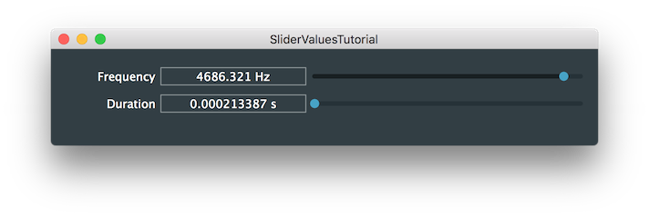
By default, the slider track is linear in the sense that the slider's value is proportional to the position of the slider thumb along the slider track. It is clear from manipulating the interface that this doesn't quite feel right. We can adjust the slider skew to make the slider track logarithmic. To do this we can use the Slider::setSkewFactorFromMidPoint() function. Try this out by adding the following two lines of code to the MainContentComponent constructor after the sliders have been configured:
This places a value of 500 at the mid-point of the slider track for the frequencySlider slider, and 0.002 for the durationSlider slider. Effectively, the sliders will now seem to move equally but in opposite directions. A non-linear slider track like this works well for parameters such as time and frequency where we tend to want finer control over smaller values but need less fine control over larger values.
SliderValuesTutorial_02.h file of the demo project for this tutorial.Instead of using the listeners and broadcasters paradigm as shown in this tutorial, we can simplify slider callbacks using lambda functions from the latest C++ standards. This works especially well for simple callbacks that don't require complex implementations.
First, let's remove the inheritance from the Slider::Listener class and restore the MainContentComponent class definition like this:
Then, instead of adding the MainContentComponent as a listener to the Slider, assign a lambda function to the Slider::onValueChange helper object as follows:
This tells the Slider object which function to call when the Slider value is changed by the user.
SliderValuesTutorial_03.h file of the demo project for this tutorial.In this tutorial we have introduced the Slider class. In particular we have learned: