
Loading...
Searching...
No Matches
Use radio buttons and checkboxes to add selectable options to your application.
Level: Beginner
Platforms: Windows, macOS, Linux, iOS, Android
Classes: ToggleButton, Button, Label, String
Download the demo project for this tutorial here: PIP | ZIP. Unzip the project and open the first header file in the Projucer.
If you need help with this step, see Tutorial: Projucer Part 1: Getting started with the Projucer.
The demo project illustrates the use of radio buttons and checkboxes in JUCE. These are normally implemented using the ToggleButton class, although any JUCE Button component can be used as an individual toggle button or as part of a "radio group". The demo application presents some headings (using the Label class) and a series of ToggleButton components:
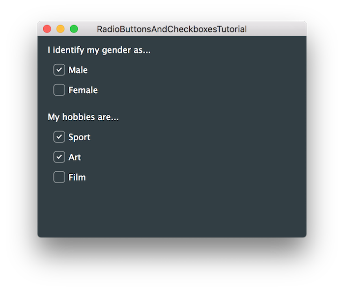
This tutorial examines the use of the Button class for creating on/off style options. Normally you will use the ToggleButton class for this, but as mentioned above, any button can be set up to be a toggle-type button. The standard ToggleButton component comprises a piece of text and a "bubble" to the left of the text that either contains a tick, or not. (And this appearance can be customised, if you wish, using the LookAndFeel class.) These two states can be seen in the screenshot in the previous section.
In the MainContentComponent constructor, the "male" and "female" buttons are set up as follows:
Here you can see that ToggleButton objects are configured in the same way as TextButton objects (as seen in Tutorial: Listeners and Broadcasters). To make these two toggle buttons mutually exclusive, we need to add them to the same "radio group". This will allow only one of these buttons to be toggled on at any one time (and toggling the other button on will, in turn, switch the other one off). A radio group ID is a non-zero integer that is used to identify the group of buttons than must be mutually exclusive. In addition to this, all buttons with the same radio group ID must be child components of the same parent component for this to work. (You would need to implement this mutually exclusive behaviour yourself if the buttons are within different parent components or different windows.)
We use an enumerated value (GenderButtons) as our radio group ID in this example:
Then we use the Button::setRadioGroupId() function to set the radio group ID.
setRadioGroupId() function is a member of the Button class, not just the ToggleButton class. Any button can be part of a radio group, but it probably only makes sense if that button is set up to expect to be toggled on and off (rather than simply intercept click events).The other three ToggleButton objects are configured without adding them to a radio group:
Responding to buttons that can be toggled on or off is similar to responding to regular button clicks. We need to specify the function we want to call when the button is toggled by assigning a lambda function to the Button::onClick helper object (as you can see in the code snippets above).
The difference is that we also need to check the toggle state of the button in our updateToggleState() function. To do this we can call the Button::getToggleState() function. Again this is a member of the Button class, so this is valid for any button (but again, probably only makes sense if you expect the button to be toggled on and off, as it will return false in other cases).
In our example we just post the toggle changes to the logger as they happen:
Notice in particular, that when you toggle on either the "Male" or "Female" button that the other button turns "off" and this is reported by the updateToggleState() function.
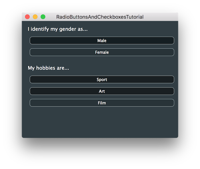
As hinted at above, any button can be used as a toggle button. To illustrate, let's convert all of the ToggleButton objects in the demo project into TextButton objects. The obvious thing that we need to do here is change the type of the member variables to the TextButton class:
But in order to make the buttons toggle-able using mouse clicks, we need to call the Button::setClickingTogglesState() function. To do this, add the following code anywhere within the MainContentComponent constructor:
Running this code will result in something that can be used like the original application but has a different appearance:
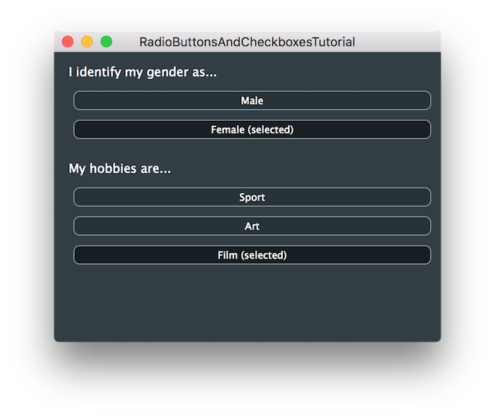
There may be cases where you want to change the text displayed depending on the button's toggle state, too. To do this, you can simply call the Button::setButtonText() function within your updateToggleState() function. To try this, revise the updateToggleState() function as follows:
In this case, we just append the text "(selected)" to the normal button text if the button is in its toggled-on state.
Now our application will looks similar to the following screenshot:
In this tutorial we have introduced the use of checkbox and radio buttons style controls. In particular you should be able to do the following things in your own applications: