
Loading...
Searching...
No Matches
Customise the drawing of fundamental widgets in your application. Make a custom skin for your application by drawing your own buttons, sliders, and other components.
Level: Beginner
Platforms: Windows, macOS, Linux, iOS, Android
Classes: LookAndFeel, Slider, Button, Path, AffineTransform
Download the demo project for this tutorial here: PIP | ZIP. Unzip the project and open the first header file in the Projucer.
If you need help with this step, see Tutorial: Projucer Part 1: Getting started with the Projucer.
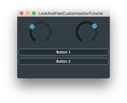
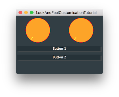
The demo project creates a GUI with two buttons and two rotary sliders using the standard JUCE look-and-feel:
The LookAndFeel class is fundamental to creating customised GUIs in JUCE. Using the LookAndFeel class you can perform simple customisations such as changing the default colours of certain components. But you can also customise the drawing of many types of component. For example, this allows you to create buttons and sliders with a custom appearance.
When a LookAndFeel object is applied to a component, it is applied to that component and its child components (see Tutorial: Parent and child components) unless the child components have specifically had a different look-and-feel assigned.
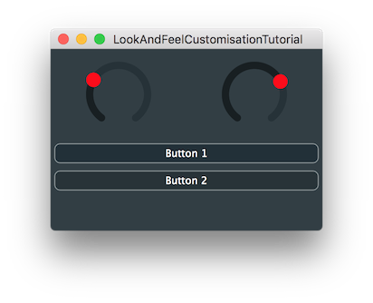
One thing that you can do with the look-and-feel system is to override specific colours for elements of the standard JUCE components (see Tutorial: Colours in JUCE.) For example, if you add the following line to the MainContentComponent constructor, then both dials will be red:
This should look something like the following screenshot:
To set the two dials differently we could make a new LookAndFeel instance and apply that to only one of the dials. First add a LookAndFeel_V4 object as a member [1] (this is the class that implements the default JUCE look-and-feel).
Then change the line of code in the constructor, that we just added, to this:
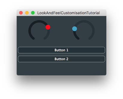
Let's use this look-and-feel only for the first dial. Add this line of code to the MainContentComponent constructor:
This should now create a UI like the following screenshot:
Of course, in this simple example this approach offers no benefits compared to setting the Slider::thumbColourId colour on the slider objects directly. But your app may use multiple sliders for different purposes where you want sliders for one purpose to use one set of colours and sliders for other purposes to use different sets of colours. This approach allows you to change these colours globally as long as each slider is assigned the appropriate look-and-feel for its type.
The benefits of this approach are clearer once we start to customise the actual drawing code. In particular, we need to create a custom look-and-feel class.
To customise the drawing of certain components we need to create a new class that inherits from the LookAndFeel class. If you inherit directly from the LookAndFeel class itself then you'll need to implement all of the pure virtual functions. It's much more practical to inherit from one of the classes that already has all of these functions defined. Then you need override only the ones you need. Let's create a simple custom look-and-feel that has only this one colour change defined compared to the default look-and-feel.
First, remove this line from the constructor, which we added earlier:
Now, add our new class, which inherits from the LookAndFeel_V4 class, before the MainContentComponent class:
Before we run this code, change the class name of our otherLookAndFeel member to OtherLookAndFeel [2]:
Build and run the application and the result should appear identical to the previous screenshot.
There are many functions in the LookAndFeel class for many different types of components. The functions that are designated for a specific component type are easy to find as these are all declared within a nested class named LookAndFeelMethods within the relevant component class.
For example, take a look at the Slider::LookAndFeelMethods within the JUCE API documentation. In this list you will notice a function named Slider::LookAndFeelMethods::drawRotarySlider().
Let's override this in our OtherLookAndFeel class. Add the declaration to the class:
Here you can see that we are passed the following data:
g: The Graphics context.x: The x coordinate of the top-left of the rectangle within which we should draw our rotary slider.y: The y coordinate of the top-left of the rectangle within which we should draw our rotary slider.width: The width of the rectangle within which we should draw our rotary slider.height: The height of the rectangle within which we should draw our rotary slider.sliderPos: The position of the slider as a proportion in the range 0..1 (this is independent of the slider's actual range of values).rotaryStartAngle: The start angle of the dial rotation (in radians).rotaryEndAngle: The end angle of the dial rotation (in radians).slider: The Slider object itself.Now let's write the function body such that it draws a simple dial that is just a filled circle with a line representing the pointer of the dial. First, we will need some temporary variables to help with our calculations based on the values we have been passed:
angle variable contains the angle at which the dial should point.Now let's add code to fill in the colour of the dial and draw an outline:
To draw the pointer itself, first we'll use a Path object that we will translate and rotate into position by the required angle:
Then we fill this path to draw the pointer:
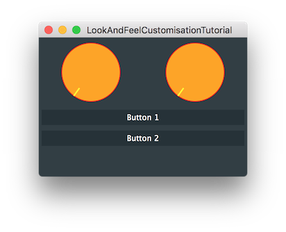
LookAndFeelCustomisationTutorial_02.h file of the demo project for this tutorial.This shows you only one simple customisation of one of the Slider look-and-feel methods. But the principle applies to the other methods. Perhaps the best approach for creating other customisations is to look at the existing implementation in the LookAndFeel_V4 or LookAndFeel_V3 classes and use this as a basis for your own code.
Let's look at customising the buttons. First, let's set our OtherLookAndFeel class as the look-and-feel for our whole MainContentComponent by using this line in its constructor:
Let's also make sure that the LookAndFeel object is not used on shutdown by the MainContentComponent anymore by supplying this line in its destructor:
This will, of course, mean that both of our dials take on the appearance we customised in the previous section. Now let's add the Button::LookAndFeelMethods::drawButtonBackground() function declaration:
Here, we are passed the following data:
g: The Graphics context.button: The Button object itself.backgroundColour: The base background colour that should be used (which will have been chosen from the LookAndFeel colours based on the toggle state of the button).isMouseOverButton: Whether the mouse pointer is within the bounds of the button.isButtonDown: Whether the mouse button is down.Now, let's add the function body to make a really simple button background that simply fills the button rectangle with the background colour:
If you build and run this, it should look similar to the following screenshot:
If you interact with this, you will notice that the buttons do not respond visually to mouse pointer interaction. Let's implement a simple shadow effect. Change the drawButtonBackground() function to this:
The button will now appear to move as we click the button. Unfortunately, the text stays static, so we need to override the Button::LookAndFeelMethods::drawButtonText() function to make this more believable. To write this function we'll start with a copy of the code from the LookAndFeel_V2 class and add it to our OtherLookAndFeel class:
We just need to change the offset at which the text is drawn to match the apparent movement in our drawButtonBackground() function. We need to change only the last few lines:
Build and run this and it should look similar to the following screenshot.
LookAndFeelCustomisationTutorial_03.h file of the demo project for this tutorial.In this tutorial we have introduced the concept of customising the look-and-feel of JUCE components using the LookAndFeel class. In particular you should now be able to: