
Loading...
Searching...
No Matches
Incorporate tables into your JUCE user interfaces. Display data loaded from an XML file and customise the format of your table.
Level: Intermediate
Platforms: Windows, macOS, Linux
Classes: TableListBox, TableListBoxModel, ListBox, ListBoxModel, TableHeaderComponent, XmlDocument, XmlElement
Download the demo project for this tutorial here: PIP | ZIP. Unzip the project and open the first header file in the Projucer.
Resources folder into the generated Projucer project.If you need help with this step, see Tutorial: Projucer Part 1: Getting started with the Projucer.
The demo project displays a table loaded from an XML file containing information about JUCE modules. The table can be sorted according to the column of your choice, certain entries can be edited and columns can be hidden.
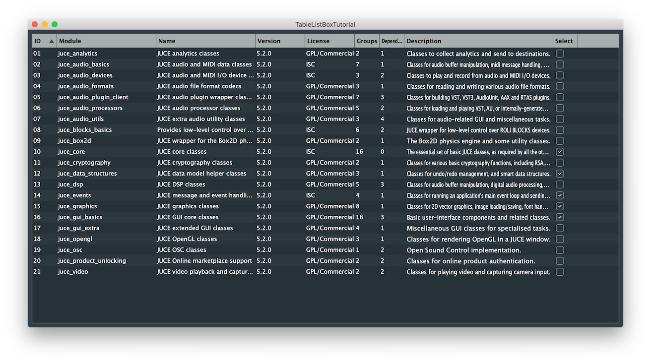
The base Component class that allows us to display tables in JUCE is called the ListBox class. The ListBox behaviour is managed by a ListBoxModel class which describes the data model to display. This is useful to display a list of items in a scrollable viewport but in order to turn this into a proper table with headers describing the columns, we can use respectively the TableListBox and TableListBoxModel classes. These classes encapsulate the same behaviour as their counterparts but instead incorporate the functionalities of a TableHeaderComponent to display column headers.
When implementing a TableListBox and inheriting the TableListBoxModel, there are several functions to override namely:
getNumRows(): Needs to return the current number of rows in the table.paintRowBackground(): Using the Graphics context provided, we must draw the background of the row specified by the row number.paintCell(): Using the Graphics context provided, we must draw the cell specified by the row and column number.refreshComponentForCell(): We can optionally override this method to create and update custom components in the table.getColumnAutoSizeWidth(): When using auto size for the width of the columns, this method can optionally specify how the column resizes itself.sortOrderChanged(): If using a custom sorting order, we can optionally specify how the column gets reordered.There are other functions that you can optionally override for additional functionality but in this tutorial we will implement the ones presented here.
Let's start by loading the data that we want to present in the table from an XML document.
In the Resources folder of the project, you can find sample data to use with this tutorial in a file called TableData.xml that contains information in the following format:
Here we encapsulate the whole file with the TABLE_DATA tag and the table headers and the actual data is separated using the HEADERS and DATA tags respectively. The columns are defined with individual COLUMN tags and the rows are defined with ITEM tags using attributes for the content in each column of that entry.
The implementation of the code in this project is tailored for this file structure but you can modify the XML tags as you wish.
In the TableTutorialComponent class, we define a pointer to temporarily store the content of the file in a single XmlElement member variable and also define two additional XmlElements for the column content and the row content as shown here:
In the class constructor, we launch a FileChooser to select the data file to display. When the FileChooser completes, it will call the callback lambda function, to load the file content into our XmlElement objects [1]. With our data loaded from the XML file, we can iterate through the column headers using a for() loop and XmlElement::getChildIterator to assign the table headers using the addColumn() function [2] like so:
This function specifies the name, width and ID of the column along with property flags that define sortability and resizability of columns.
In the loadData() helper function called in the constructor, we first find the Resources directory and the XML file to load and parse this File object using the parse() function [3]. We can then retrieve the rows and columns from the temporary XmlElement by traversing the XML structure and finding the corresponding tags with the getChildByName() functions [4]. This is a good place to set the number of rows from the data XmlElement by calling getNumChildElements() on it [5] as follows:
Let's also define a helper function called getAttributeNameForColumnId() that returns the name of the column based on its ID which will become handy later on:
Here we iterate through the child XML elements and find the matching column ID in order to return its name attribute.
A TableListBox can hold custom components in its cells other than just text. In the following sections we explore how to incorporate a ToggleButton into one of the columns and an editable Label that listens to user input.
In the EditableTextCustomComponent class, we first inherit from the Label class in order to set it as editable when the user double-clicks on it:
Here we also keep track in which row and column this object is displayed and a reference to the actual table.
When the user interacts with the Label, we have to extend the usual mouseDown() functionalities to account for multiple selections in the table. This is achieved by calling selectRowsBasedOnModifierKeys() on the table and passing the modifier keys as an argument. Notice here that we still need to call the base class function to keep the original behaviour as well:
When the user edits the text in the Label, we receive a callback from the textWasEdited() function and we call the helper function setText() defined later in the TableTutorialComponent class to save the changes in the corresponding XmlElement object like so:
The following function is called by the TableListBoxModel when creating or updating an EditableTextCustomComponent object and sets the row, column and the displayed text from the XmlElement using the getText() helper function defined after:
The getText() and setText() helper functions are defined as follows:
Here we find the text from the row and column number in the child element contained within the XmlElement.
Here we store the text in the child element contained within the XmlElement from the row and column number.
In the SelectionColumnCustomComponent class, we first inherit from the Component class in order to set a ToggleButton as a child Component to it and assign the callback function to be called when the user interacts with it:
Here we also keep track in which row and column this object is displayed and a reference to the actual table. The lambda function calls the setSelection() helper function defined later in the TableTutorialComponent that sets the toggle state of the button.
The resized() function sets the bounds of the ToggleButton object.
The following function is called by the TableListBoxModel when creating or updating a SelectionColumnCustomComponent object and sets the row, column and the toggle state from the XmlElement using the getSelection() helper function defined after:
The getSelection() and setSelection() helper functions are defined as follows:
Here we find the toggle state from the row and column number in the child element contained within the XmlElement.
Here we store the toggle state in the child element contained within the XmlElement from the row and column number.
In order for the table to sort elements based on a chosen column, we have to define a comparator class that can be passed as a template class to be used by the sortChildElements() function of the XmlElement object.
We name this class TutorialDataSorter that keeps track of the name of the XmlElement attribute to sort and the ascending or descending direction of the sorting algorithm as follows:
For the sortChildElements() function to recognise the TutorialDataSorter as a valid comparator, we have to declare a function named compareElements() that takes two XmlElement objects and returns the order as an int.
The function is required to return:
Therefore, in the above function we compare the string attributes of both XmlElements by using the compareNatural() method of the String class which returns an int with the same set of rules [1]. If the two strings are equivalent for the attribute in question then we compare the ID column of these two elements [2]. Finally we need to invert the result if the direction of sorting is reversed [3].
Let's assemble all the pieces together by implementing the TableListBoxModel.
We first start by inheriting from the TableListBoxModel class in the TableTutorialComponent class as shown here:
Here we define a TableListBox member variable and set this class as its TableListBoxModel which means that our model class actually holds the table itself in this scenario. We also keep track of the number of rows in the table as required by the model.
In the class constructor we add the TableListBox as a child Component [1]. We can also specify properties for the appearance of the table such as the outline colour and its thickness [2].
The sorting column and the column visibility is set by calling corresponding functions on the TableHeaderComponent of the table [3] and we also allow multiple selections on the table [4].
The first function to override is the getNumRows() function that returns the member variable holding the number of rows. This function is necessary for the model to update the table properly:
The paintRowBackground() function is implemented by first finding an alternate colour that complements the default background colour for the table:
The row is then filled in light blue if the row is selected, otherwise we paint every other row with this alternate colour.
In order to fill the cells with content we override the paintCell() function as follows:
When a sort order change is requested by the user, the sortOrderChanged() callback function is called and if the sort column is valid, we instantiate a TutorialDataSorter object with the correct attribute and direction. We can then pass that object to the sortChildElements() function of the XmlElement and force a table refresh by calling updateContent() on the table.
The refreshComponentForCell() function is where the custom cell components can be instantiated and updated as follows:
SelectionColumnCustomComponent already exists in the cell. If not we instantiate a new instance and update its content by calling the setRowAndColumn() function on it and return the Component.EditableTextCustomComponent already exists in the cell. If not we instantiate a new instance and update its content by calling the setRowAndColumn() function on it and return the Component.Finally, the TableListBox offers a nice feature where the columns can be resized according to an automatic behaviour defined hereafter in the getColumnAutoSizeWidth() function:
Here we decide to inspect all the elements in a certain column and retrieve the widest text in a cell. We then return the width with some added padding or a fixed width if the column happens to be the "Select" column with a custom ToggleButton.
In this tutorial, we have learnt how to display information in a table. In particular, we have: