Loading...
Searching...
No Matches
Tutorial: Advanced GUI layout techniques

Lay out your components with a simple yet powerful technique that will produce elegant code with fewer bugs. The technique involves subdividing the component rectangle several times, in different ways, to fill the entire component with your content.

Level: Intermediate

Platforms: Windows, macOS, Linux, iOS, Android

Classes: Rectangle, TextButton, Colours

Getting started

Download the demo project for this tutorial here: PIP | ZIP. Unzip the project and open the first header file in the Projucer.

If you need help with this step, see Tutorial: Projucer Part 1: Getting started with the Projucer.

The demo project

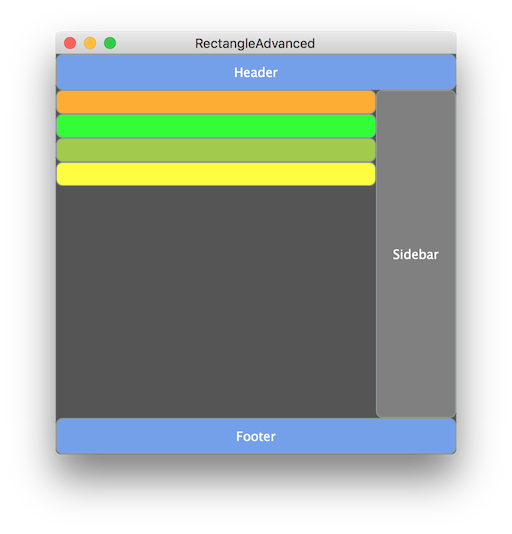
The demo project uses a small number of button components and lays them out within the parent component. In this example we're just using buttons as placeholders, but they could be any type of JUCE component. When you build and run the application from within your IDE, the main window should look similar to the following screenshot.

Simple application layout

Rectangle layouts

In this simple application, we have a number of sections in our main window:

  • A header section that might contain a title or perhaps a toolbar.
  • A footer section that might contain some other information about the application.
  • A sidebar that might contain a series of sections or other content.
  • Several content items listed in the remainder of the window.

These are added in the MainContentComponent constructor (see Tutorial: Parent and child components and Tutorial: Colours in JUCE):

MainContentComponent()
{
header.setColour (juce::TextButton::buttonColourId, juce::Colours::cornflowerblue);
header.setButtonText ("Header");
addAndMakeVisible (header);
footer.setColour (juce::TextButton::buttonColourId, juce::Colours::cornflowerblue);
footer.setButtonText ("Footer");
addAndMakeVisible (footer);
sidebar.setColour (juce::TextButton::buttonColourId, juce::Colours::grey);
sidebar.setButtonText ("Sidebar");
addAndMakeVisible (sidebar);
limeContent.setColour (juce::TextButton::buttonColourId, juce::Colours::lime);
addAndMakeVisible (limeContent);
grapefruitContent.setColour (juce::TextButton::buttonColourId, juce::Colours::yellowgreen);
addAndMakeVisible (grapefruitContent);
lemonContent.setColour (juce::TextButton::buttonColourId, juce::Colours::yellow);
addAndMakeVisible (lemonContent);
orangeContent.setColour (juce::TextButton::buttonColourId, juce::Colours::orange);
addAndMakeVisible (orangeContent);
setSize (400, 400);
}

The actual laying out is commonly done by overriding Component::resized().

Traditional laying out

Traditionally, you would lay out your component by calculating the various positions and sizes, being careful that these always sum to the correct total size. Even laying out the coloured buttons in the the main part of our window becomes tedious, and it is easy to make mistakes. To lay out four equally-sized buttons we might do something like this:

//...
limeContent .setBounds (0, 0, 200, 24);
grapefruitContent.setBounds (0, 24, 200, 24);
lemonContent .setBounds (0, 48, 200, 24);
orangeContent .setBounds (0, 72, 200, 24);
//...

(I proved my own point when writing this tutorial by getting the final orangeContent component in the wrong place twice!)

At the very least the calculations are time-consuming when you can be focusing your coding efforts on more important things! The Rectangle class provides some simple yet powerful features for making the job of laying out components more flexible, and in some ways easier, once you are familiar with the technique. This involves subdividing the main rectangle into smaller and smaller sub-rectangles.

Layout by subdividing rectangles

Laying out your component by subdividing the main rectangle into smaller and smaller parts might seem equivalent to the traditional method. But there are a number of benefits:

  • It encourages you to use fewer magic numbers (hard-coded values) in your code, which make modifying and maintaining your layout harder in the future.
  • In many cases the layout can be modified by simply re-ordering the code, rather than having to change any of the values!
  • It is much easier to ensure that you have filled the available space precisely, rather than finding that you layout extends beyond the parent component or doesn't quite fill it.
  • It is easier to work with resizable components and make rules for certain sections that must be at least a certain size.

The code for the MainContentComponent::resized() function in the demo application looks like this:

void resized() override
{
auto area = getLocalBounds();
auto headerFooterHeight = 36;
header.setBounds (area.removeFromTop (headerFooterHeight));
footer.setBounds (area.removeFromBottom (headerFooterHeight));
auto sidebarWidth = 80;
sidebar.setBounds (area.removeFromLeft (sidebarWidth)); // [2]
auto contentItemHeight = 24;
orangeContent.setBounds (area.removeFromTop (contentItemHeight));
limeContent.setBounds (area.removeFromTop (contentItemHeight)); // [1]
grapefruitContent.setBounds (area.removeFromTop (contentItemHeight));
lemonContent.setBounds (area.removeFromTop (contentItemHeight));
}

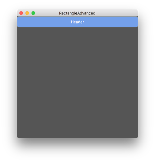
Let's look in detail at the first few lines of this function. First we get the local bounds of the component we are laying out, using the Component::getLocalBounds() function. This always returns a rectangle that is at position (0, 0) with the same width and height as the component:

This is the rectangle that we are going to subdivide in order to lay out the child components. Our first subdivision is to lay out the header:

Here we take the rectangle that represents the whole component and effectively create two rectangles. The Rectangle::removeFromTop() function returns a rectangle that is at the position of the original rectangle, the same width, but only the height requested by the argument. In this case we ask for a rectangle that is 36 pixels high. The other thing that this function does is that it modifies the original rectangle removing the rectangle that we just returned. Essentially, it slices the rectangle at 36 pixels from the top, returns the upper rectangle and modifies the original rectangle to be equal to the lower rectangle.

On its own, it would look like this:

Our first subdivision

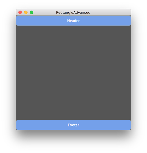
The second subdivision is to lay out the footer:

The Rectangle::removeFromBottom() function does the same as the Rectangle::removeFromTop() function, except it removes a rectangle from the bottom of the main rectangle and retains the upper rectangle. At this point, our component looks like this:

Our second subdivision
  • We then create the sidebar by removing 80 pixels from the left of the remaining rectangle.
  • We then subdivide the remaining rectangle multiple times by using the Rectangle::removeFromTop() function.

Finally we end up with the fully laid out component.

Reordering items

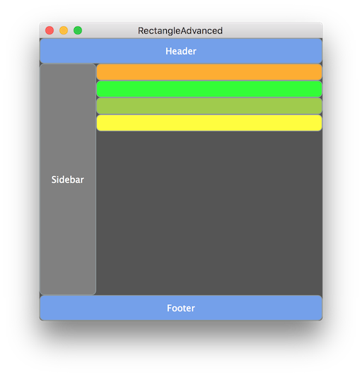
As mentioned earlier, it is really easy to reorder items using this technique. For example, we could move the orange content at the top simply by listing it first in the resized() function [1]:

auto contentItemHeight = 24;
orangeContent.setBounds (area.removeFromTop (contentItemHeight));
limeContent.setBounds (area.removeFromTop (contentItemHeight)); // [1]
grapefruitContent.setBounds (area.removeFromTop (contentItemHeight));
lemonContent.setBounds (area.removeFromTop (contentItemHeight));

This looks like this:

Reordering items
Note
With a fixed number of components this approach is clearly more elegant. It is even more useful when rendering variable content.

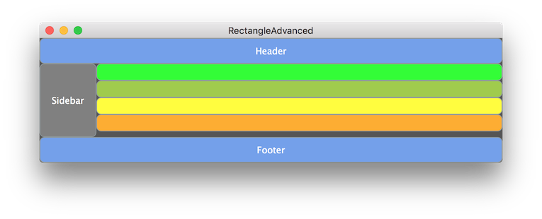
We can't move the sidebar to the right-hand side simply by reordering items, but it is just matter of using the Rectangle::removeFromRight() function rather than Rectangle::removeFromLeft() [2]:

auto sidebarWidth = 80;
sidebar.setBounds (area.removeFromLeft (sidebarWidth)); // [2]

This now looks like this:

Moving the sidebar to the right

Resizing the component

Another thing that we get for free with this approach is that resizing often "just works". Here is the component made wider but less high:

Resizing our simple layout

If we want some or all of the layout to be proportional, then that's easy to factor into our code. For example, we might want the sidebar to always be a quarter of the total width:

sidebar.setBounds (area.removeFromRight (area.getWidth() / 4));

If you try this, then you will find that there is a lower useful limit. This is easy to incorporate in this approach too. Try this instead, which sets the sidebar width to a quarter of the total width, but makes 80 pixels the lower limit:

sidebar.setBounds (area.removeFromRight (juce::jmax (80, area.getWidth() / 4)));
Exercise
Create several more buttons with different colours and add them, arranged horizontally, to the section below the orangeContent, limeContent, grapefruitContent, and lemonContent components. Make them fill the entire remaining width.

Other scenarios

In the examples up to this point we have continued to subdivide the remaining rectangle to position the next component in our sequence. There are some cases where you will need to store one of the sub-rectangles and subdivide that instead.

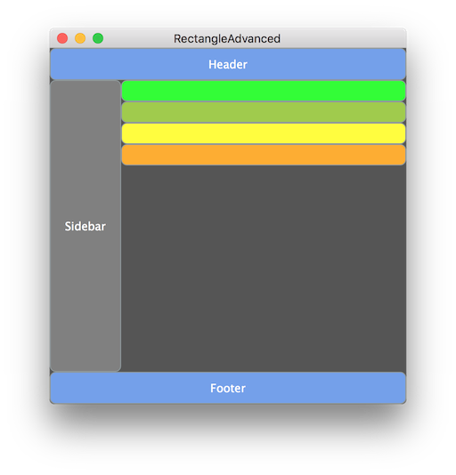
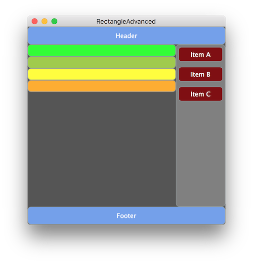
For example, to place items in a list within the sidebar in our example, we would need to store the sidebar rectangle temporarily, then subdivide that. To illustrate this, add three more components to the demo project [3], [4], and [5]:

private:
juce::TextButton header;
juce::TextButton sidebar;
juce::TextButton sideItemA; // [3]
juce::TextButton sideItemB; // [4]
juce::TextButton sideItemC; // [5]
juce::TextButton limeContent;
juce::TextButton grapefruitContent;
juce::TextButton lemonContent;
juce::TextButton orangeContent;
juce::TextButton footer;

Then configure them in the constructor, while removing the text from the sidebar button [7]:

//...
sidebar.setColour (juce::TextButton::buttonColourId, juce::Colours::grey);
// [7]
addAndMakeVisible (sidebar);
sideItemA.setColour (juce::TextButton::buttonColourId, juce::Colours::maroon);
sideItemB.setColour (juce::TextButton::buttonColourId, juce::Colours::maroon);
sideItemC.setColour (juce::TextButton::buttonColourId, juce::Colours::maroon);
sideItemA.setButtonText ("Item A");
sideItemB.setButtonText ("Item B");
sideItemC.setButtonText ("Item C");
addAndMakeVisible (sideItemA);
addAndMakeVisible (sideItemB);
addAndMakeVisible (sideItemC);
//...

Finally, change the resized() function to the following:

void resized() override
{
auto area = getLocalBounds();
auto headerFooterHeight = 36;
header.setBounds (area.removeFromTop (headerFooterHeight));
footer.setBounds (area.removeFromBottom (headerFooterHeight));
auto sideBarArea = area.removeFromRight (juce::jmax (80, area.getWidth() / 4));
sidebar.setBounds (sideBarArea);
auto sideItemHeight = 40;
auto sideItemMargin = 5;
sideItemA.setBounds (sideBarArea.removeFromTop (sideItemHeight).reduced (sideItemMargin));
sideItemB.setBounds (sideBarArea.removeFromTop (sideItemHeight).reduced (sideItemMargin));
sideItemC.setBounds (sideBarArea.removeFromTop (sideItemHeight).reduced (sideItemMargin));
auto contentItemHeight = 24;
orangeContent.setBounds (area.removeFromTop (contentItemHeight));
limeContent.setBounds (area.removeFromTop (contentItemHeight));
grapefruitContent.setBounds (area.removeFromTop (contentItemHeight));
lemonContent.setBounds (area.removeFromTop (contentItemHeight));
}

Notice also the use of the Rectangle::reduced() function which insets the edges of the rectangle, effectively placing the rectangle within a margin. Build and run the application and it should now look like this.

More sophisticated subdivisions

Summary

In this tutorial we have explored the use of a particular set of functions within the Rectangle class for subdividing rectangles. In particular, we have seen that using this technique for laying out components. We can:

  • Lay out components out with more elegant code.
  • Reduce the use of magic numbers in the layout code.
  • Change layout positions, and the order in which the components are laid out, using minimal changes to the code.

See also

linkedin facebook pinterest youtube rss twitter instagram facebook-blank rss-blank linkedin-blank pinterest youtube twitter instagram