
Loading...
Searching...
No Matches
This tutorial introduces the Label class, which is a component for displaying text. A Label component can also be set to be editable so it's really useful for displaying text and simple text entry.
Level: Beginner
Platforms: Windows, macOS, Linux, iOS, Android
Classes: Label, TextEditor, Font, Colours
Download the demo project for this tutorial here: PIP | ZIP. Unzip the project and open the first header file in the Projucer.
If you need help with this step, see Tutorial: Projucer Part 1: Getting started with the Projucer.
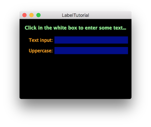
The demo project includes a number of labels. Some of these are for displaying text, but one of them is for entering text. Run the demo project and it should look like the following screenshot:
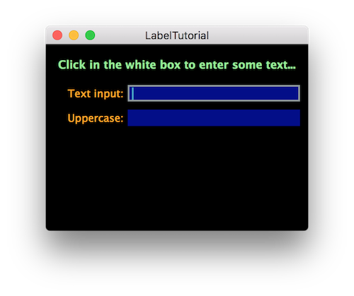
When you click on the label with the white background it becomes editable, the label shows a subtle border, and a caret appears. This is shown in the following screenshot.
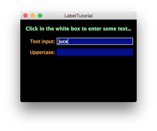
Text can then be entered into this label as shown below:
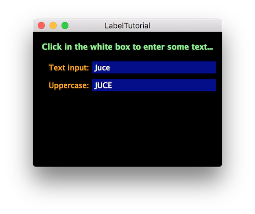
When you hit return or click away from the label it goes out of its editable state. This commits a change that is broadcasted to its listeners. In this case we convert the text to uppercase and display it in another label:
This illustrates several different uses of the Label class for both displaying and entering text. There are actually five labels here that are used in slightly different ways:
The second of the rectangular boxes is very slightly greyed out to distinguish it from the text entry box.
This tutorial covers most of the main features of the Label class. The most fundamental feature of a label is that it displays some text! While you can draw your own text in your component's paint() function (see Tutorial: The Graphics class) it is usually much more convenient to manage the layout of text using Label objects (or TextEditor objects in some cases).
As you would expect, the text within a Label object can be displayed in any font, font size, bold, italics, and so on. The text can also be justified (aligned) within the component bounds to the left, right, centre, top, bottom, and using various other options.
If the bounds of the component are too small to display all of the text requested then the Label class will try a few things to make the text fit. First, it will make the glyphs of the font a little narrower. If the glyphs are too narrow then the text will be unreadable, so beyond a certain point it gives up. In this case it truncates the text showing an ellipsis (...) at the end to show that this has been done. You can try this now by typing in the text "The quick brown fox jumps over the lazy dog" in the text entry label. In fact you can copy the text ("CMD-C" to copy on Mac OS X or "Ctrl-C" on Windows) from this page and paste it into the label using keyboard shortcuts ("CMD-V" to paste on Mac OS X or "Ctrl-V" on Windows). This capability is built in without you needing to add any code!
The result should be something like this:
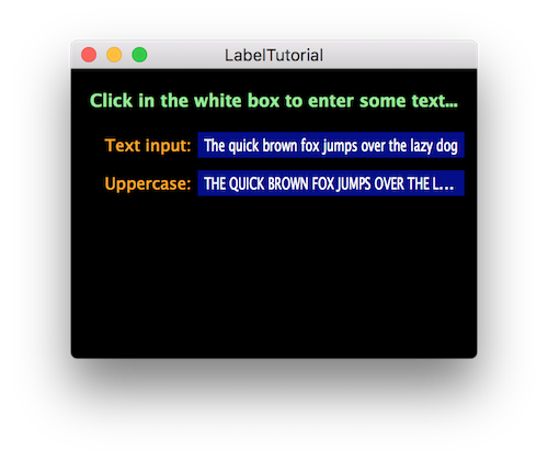
The original text just about fits but it is slightly squashed in the horizontal axis. The uppercase version is going to be a little wider since uppercase glyphs are usually wider than lowercase glyphs. The Label class decided that the uppercase version is too wide for it to squash the text in the horizontal axis and keep it readable. In this case it has truncated the text at the "L" in "LAZY" and added the ellipsis.
1.0f will disable the scaling. You can measure the height required for a single line in a particular font using the Font::getHeight() function. To measure the width that an entire string would require to fit on a single line you can use the Font::getStringWidth() function.In the MainContentComponent constructor each of the labels in our application is configured. First we set up the title with a 16-point bold font, the text it should contain, the colour of the text, and we justify the text to the centre.
Add the label to the parent component:
Set the font for the label:
Set the text to be displayed within the label:
Set the colour of the label text:
Justify the display of the label text:
As its name suggests, a Label component is often used as a label for another component. In this case a Label object can be attached to another component. Once a label is attached only the owner component needs to be positioned. The attached label will follow its owner around the parent component. In our case we want the inputLabel object (that displays the text Text input:) to be attached to the inputText object. The second argument to the Label::attachToComponent() function states whether the label should be attached to the left or above the owner. The true argument means that it should be attached to the left:
The labels to display the uppercase text are set up similarly:
In the resized() function we need to position only three of our five labels:
The final label that we set up in the MainContentComponent constructor is the editable text field.
The lambda function is the callback for the Label::onTextChange helper object. Here we get the entered text, convert it to uppercase using the String class, and set the text of the uppercaseText label.
sendNotification instead of dontSendNotification when calling Label::setText(). This will cause a label's listeners to be notified of the change (if the text is different from its current contents) in addition to the user changing the text from the user interface.There are a few other customisations that can be made. In particular labels can display multiline text. You may also want to customise the editor for editable labels.
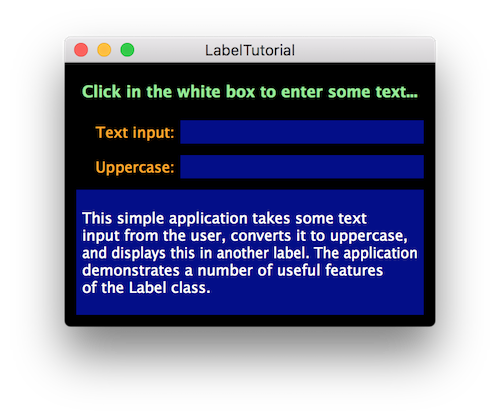
While the TextEditor class is more flexible for large amounts of text, the Label class can display multiple lines of text. To do this, you just need to ensure that the height of the component is large enough to display more than one line of text.
To illustrate this, add the following member to the MainContentComponent class:
And add the following code to the MainContentComponent constructor:
Finally, set the bounds of the infoLabel component in the resized() function:
Run the application and it should look something like this:
Some of the editor features can be set via the Label class itself. When the editor is created the Label class copies the font style and colours to the editor. Some of the Label::ColourIds values relate to the editor. For example, to change the border around the label when it is being edited you can use the Label::outlineWhenEditingColourId value for the Component::setColour() function:
Other customisations can be achieved by implementing the Label::onEditorShow helper object. For example, you could make the text italic when being edited like this:
This tutorial has examined the Label class. While it is very easy to use, there are a number of useful features that make it powerful. We have covered: