
Loading...
Searching...
No Matches
This tutorial introduces the ComboBox class, which is a component for displaying lists of items to the user. The contents of a ComboBox object can be modified dynamically, and can be used for text input, too.
Level: Beginner
Platforms: Windows, macOS, Linux, iOS, Android
Classes: ComboBox, Label, Font, Colour, Colours
Download the demo project for this tutorial here: PIP | ZIP. Unzip the project and open the first header file in the Projucer.
If you need help with this step, see Tutorial: Projucer Part 1: Getting started with the Projucer.
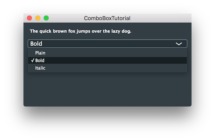
The demo project displays a piece of text at the top of the window within a Label component (see Tutorial: The Label class). A ComboBox component contains the items Plain, Bold, and Italic. The user can select one of these items to change the style of the text within the label.
This tutorial introduces many of the features of the ComboBox class. A ComboBox component contains a list of text strings. Each of these text strings is associated with an ID number (an int value). You can query which item is currently selected, either by:
The ComboBox class is also a broadcaster. To listen for changes you can register a ComboBox::Listener class (see Tutorial: Listeners and Broadcasters) or alternatively use a Lambda function with the ComboBox::onChange helper object.
Let's examine the demo project. In our MainContentComponent class we have four private members:
The Label and Font objects are configured in the constructor:
Items can be added to a ComboBox object one at a time using the ComboBox::addItem() function. Here we add the "Plain", "Bold", and "Italic" items with ID numbers 1, 2, and 3 respectively:
We could have registered our MainContentComponent object as a listener to get notified when the styleMenu ComboBox object is changed by the user in the application. But in this case we implement the ComboBox::onChange helper object to directly call the styleMenuChanged() function:
The styleMenuChanged() function handles changes to the styleMenu object:
Here you can see that we set the textFont Font object appropriately based on the user's selection. Then we use this font to update the textLabel Label object's font.
You can use any integer as an item ID except zero. Zero has a special meaning. It is used to indicate that none of the items are selected (either an item hasn't been selected yet or the ComboBox object is displaying some other custom text).
With a small selection of items using simple numbers like 1, 2, and 3 in your code is easy to manage. This would quickly become unmanageable as you develop your app further. In our case it would be clearer to use an enum. Let's add a private enum for our styles:
Then we can use these values when setting up the ComboBox object:
And in our styleMenuChanged() function:
At the very least this make the code much more readable.
Other common strategies for using ID numbers are:
The list of items in a combo-box can contain dividers and section headings. This is especially useful in very long lists. Let's add a combo-box to our app that changes the text colour. First, let's add another enum for our colours:
And a new member to our MainContentComponent class:
In the MainContentComponent constructor we need to add the code to set up the new combo-box. Here we introduce two new functions, ComboBox::addSeparator() and ComboBox::addSectionHeading():
You can use separators without section headings and section headings without separators but they do work well together.
We need to implement a new function to handle the changes to the coloursMenu object:
Don't forget to set the bounds of the coloursMenu object in the resized() function:
Run the project and the window should look something like this:
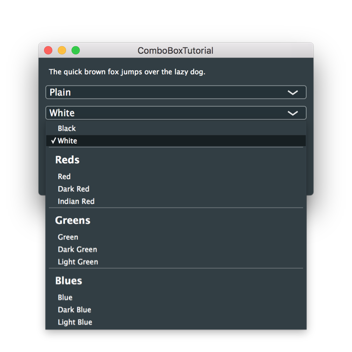
You can now change the colour of the label text.
The default behaviour of a combo-box is to allow the user to select only the items listed. But, you can make the combo-box editable to allow the user to enter other text. In the MainContentComponent constructor let's make our coloursMenu object editable:
Now let's add a function that takes the text from the coloursMenu object and treats the text as a hexadecimal colour code. The colour code is in the ARGB format (for example, "ff888888"" would be an opaque mid-grey colour):
@snippet GUI/ComboBoxTutorial/ComboBoxTutorial_02.h handleColourText
Notice that we convert the string to a hex value then convert it back to a string, setting the combo-box text. This is a simple way to filter the text entered.
@note A more sophisticated method to filter input text would be to implement a custom class that derives from the ComboBox class. Then you can override its Label::Listener::editorShown() virtual function to customise its text editor. You can use the TextEditor::setInputFilter() function to use a TextEditor::InputFilter object to filter the text entered before it even appears on the screen.
In our <code class="project_code">coloursMenuChanged()</code> function we need to update the <code class="code">switch..case</code> to call our <code class="project_code">handleColourText()</code> function in the <code class="code">default</code> case:
@snippet GUI/ComboBoxTutorial/ComboBoxTutorial_02.h coloursMenuChanged
@image html tutorial_combo_box_screenshot3.png "Entering custom text"
Run the application and you should be able to enter custom colours in the six-digit hex format (RGB).
<dl class="section attention"><dt>Exercise</dt><dd>
Modify the code to add any custom hex colours to the <code class="project_code">coloursMenu</code> combo-box so that the user can choose these items again if they wish.
</dd></dl>
@subsection tutorial_combo_box_disabling_enabling Disabling and enabling items
Items in a combo-box can be disabled and enabled (they are, of course, enabled by default). When they are disabled they will still be visible but shown greyed-out. Let's change the code so that none of the lighter versions colours (and white) can be selected if the bold style is selected. First, let's add a function to disable or enable the lighter colours using the ComboBox::setItemEnabled() function:
@snippet GUI/ComboBoxTutorial/ComboBoxTutorial_02.h setLightColoursEnabled
Now let's refactor our <code class="project_code">styleMenuChanged()</code> function and make use of the <code class="project_code">setLightColoursEnabled()</code> function:
@snippet GUI/ComboBoxTutorial/ComboBoxTutorial_02.h styleMenuChanged
Notice that in the <code class="project_code">setStyleBold()</code> function we disable the lighter colours and we need to enable them in the other cases. Run the application and you should now see that the lighter colours are disabled when the <b class="onscreen_text">Bold</b> style is selected.
@image html tutorial_combo_box_screenshot4.png "Disabling combo-box items"
<dl class="section attention"><dt>Exercise</dt><dd>
One problem here is that you can select a lighter colour <em>then</em> choose the bold style. Modify the code to change the colour back to <b class="onscreen_text">black</b> if one of the lighter colours is selected when the user selects the <b class="onscreen_text">Bold</b> style.
</dd></dl>
@section tutorial_combo_box_notes Notes
The final implementation of the code for this tutorial can be found in the <code class="filename">ComboBoxTutorial_02.h file of the demo project.
This tutorial has introduced the ComboBox class. After reading this tutorial you should be able to: